I wore a lot of hats at BAGGU — in addition to being our Creative Director for brand, I was also our digital product design lead. My tenure coincided with period of massive growth for BAGGU's e-commerce channels, and over the course of five years I worked on numerous improvements to our e-com sites, all aimed at furthering that growth.
The largest of these was a complete headless rebuild of our two primary e-com channels — baggu.com and wholesale.baggu.com.
The recommendation to go headless came from our product manager, Kara O'Connor, who saw opportunities to minimize load times, improve site performance, streamline operations, and augment our analytics. She also sourced an amazing development team — Kevin Green of ctrl alt delete, along with the folks at Baggy.
I was the sole designer for most of the project, delivering design from wireframes and mockups, to prototypes used for testing, to production specs and QA. Freed from the usual limitations of Shopify's architecture, the rebuild was a perfect opportunity to redesign the whole site from the ground up, resolving a host of known pain points and actualizing a long wishlist of custom features.
The project was a huge lift run on a skeleton crew, but we nevertheless managed to relaunch on time and on budget. Many thanks to all involved ✨🙏✨
Project Team
Development: Kevin Green
Additional development: Baggy
Design, prototyping, QA: myself
Design assistance: Julie Kim
Product & project management: Kara O'Connor
Content population & e-com operations: Farrah Wong, Todd Nguyen
Tech stack: Next, React, Shopify, Sanity, Algolia
Twice the channels, half the management
Prior to the rebuild, one of our biggest operational challenges was running two separate Shopify storefronts — one for retail (baggu.com), one for wholesale (wholesale.baggu.com). With every new season launch, we needed do essentially the same product and collection setup work twice, and every season was getting bigger and more complicated than the last.
The new headless CMS — built on Sanity — vastly streamlined our setup process. Products and collections could be populated once and then pushed to both retail and wholesale, with any necessary data automatically syncing back to the individual Shopify storefronts.
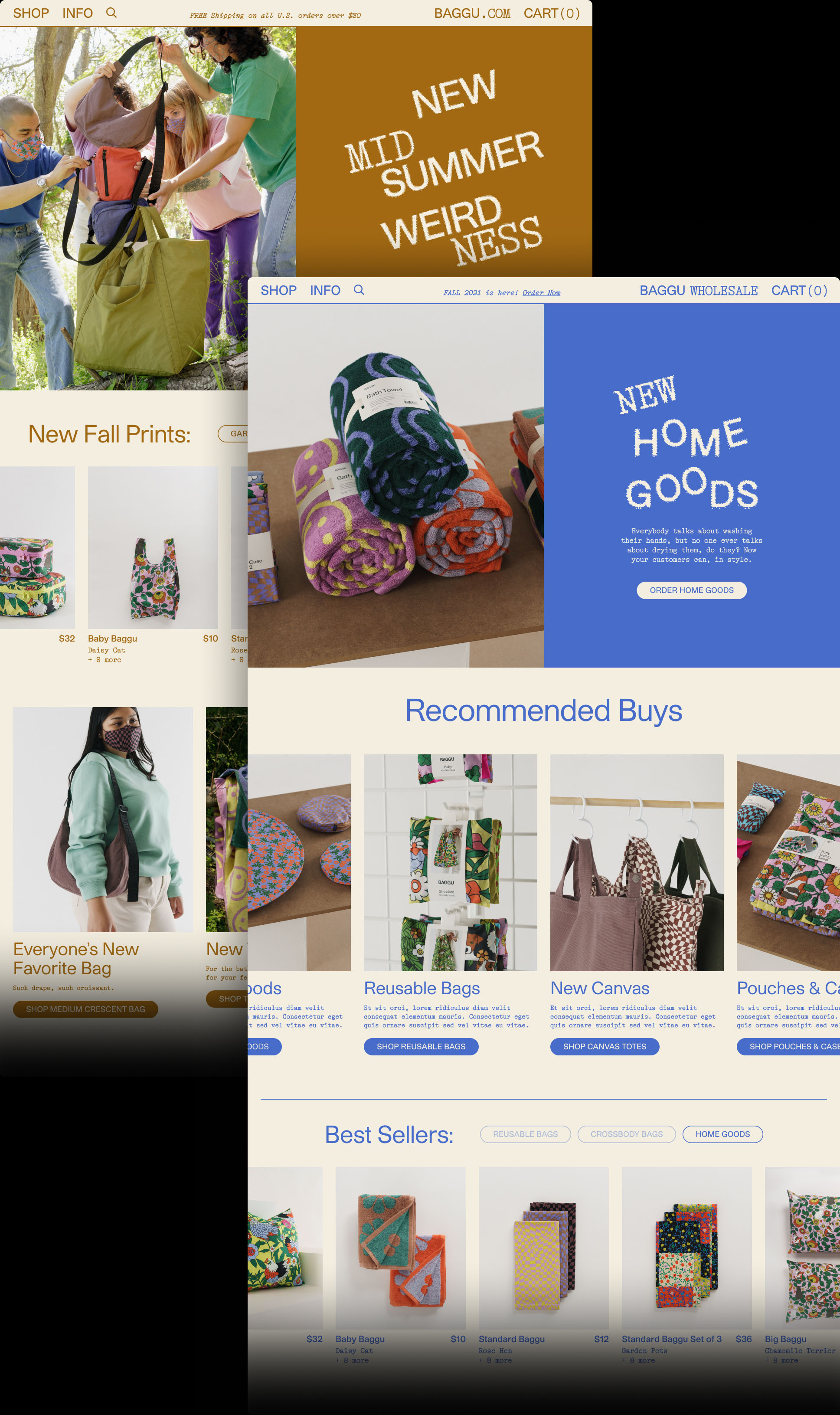
Flexible collection landings, designed for product assortments at every scale
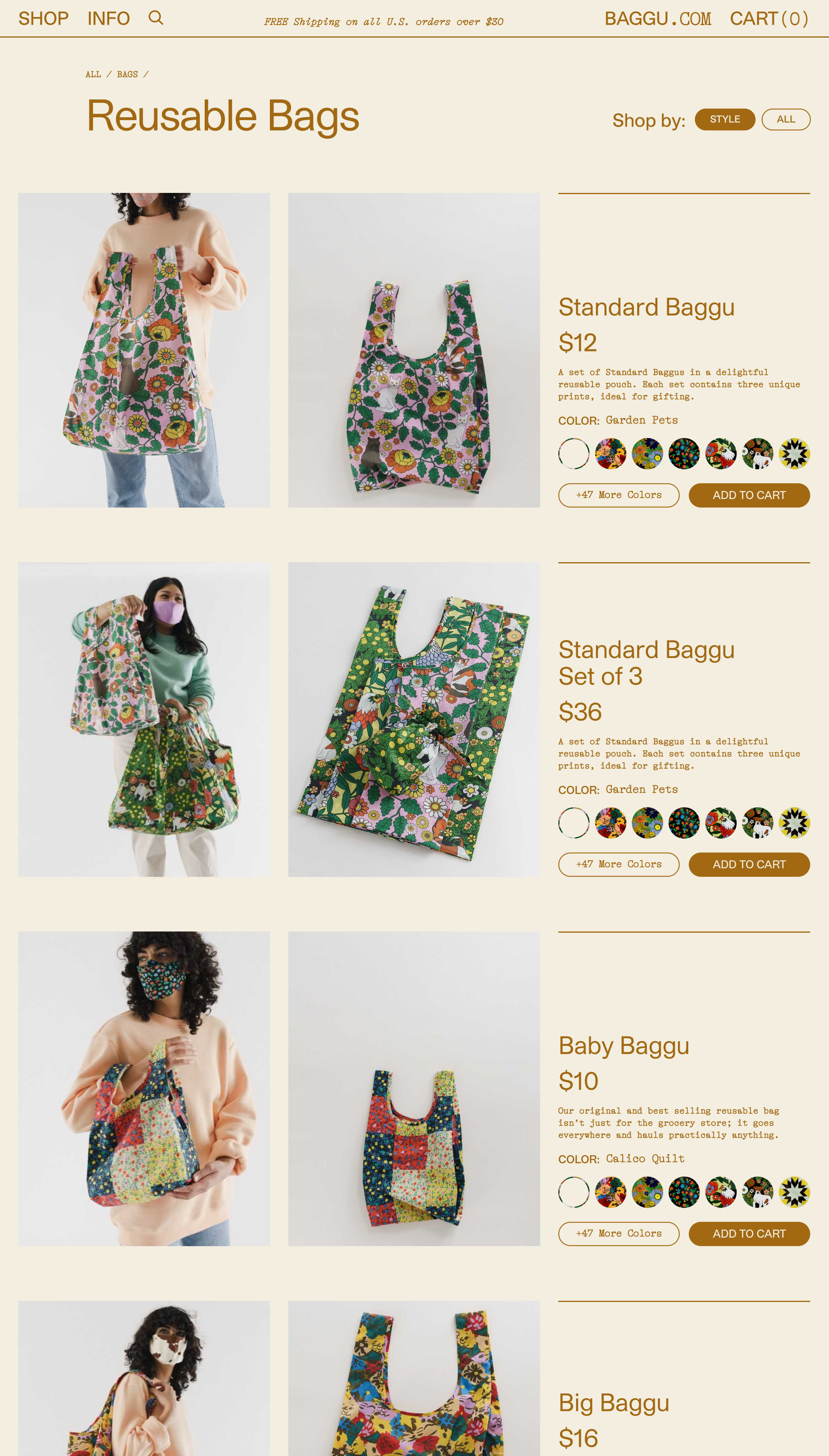
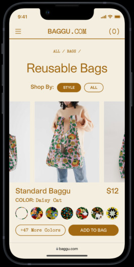
Merchandising was another perpetual challenge. How do you present an assortment that includes hundreds of bags, and then a scattered handful of other things like hats, towels, and accessories? Our solution was to develop a suite of templates suited to different collection scales, as well as different users' browsing preferences.
Left: The first of these templates was a “style" based collection, specifically aimed at newer customers. BAGGU produces a lot of very similar products in varying sizes and shapes — eg. Baby Baggu, Standard Baggu, Big Baggu, etc. — and so we needed a way to make similar product styles quickly comparable for someone unfamiliar with the line.
We also had to manage the reality that our best selling product category — reusable bags — often included dozens of individual products featuring bold, colorful prints. Seasoned fans knew the line well, and would return to shop new prints and colors specifically.
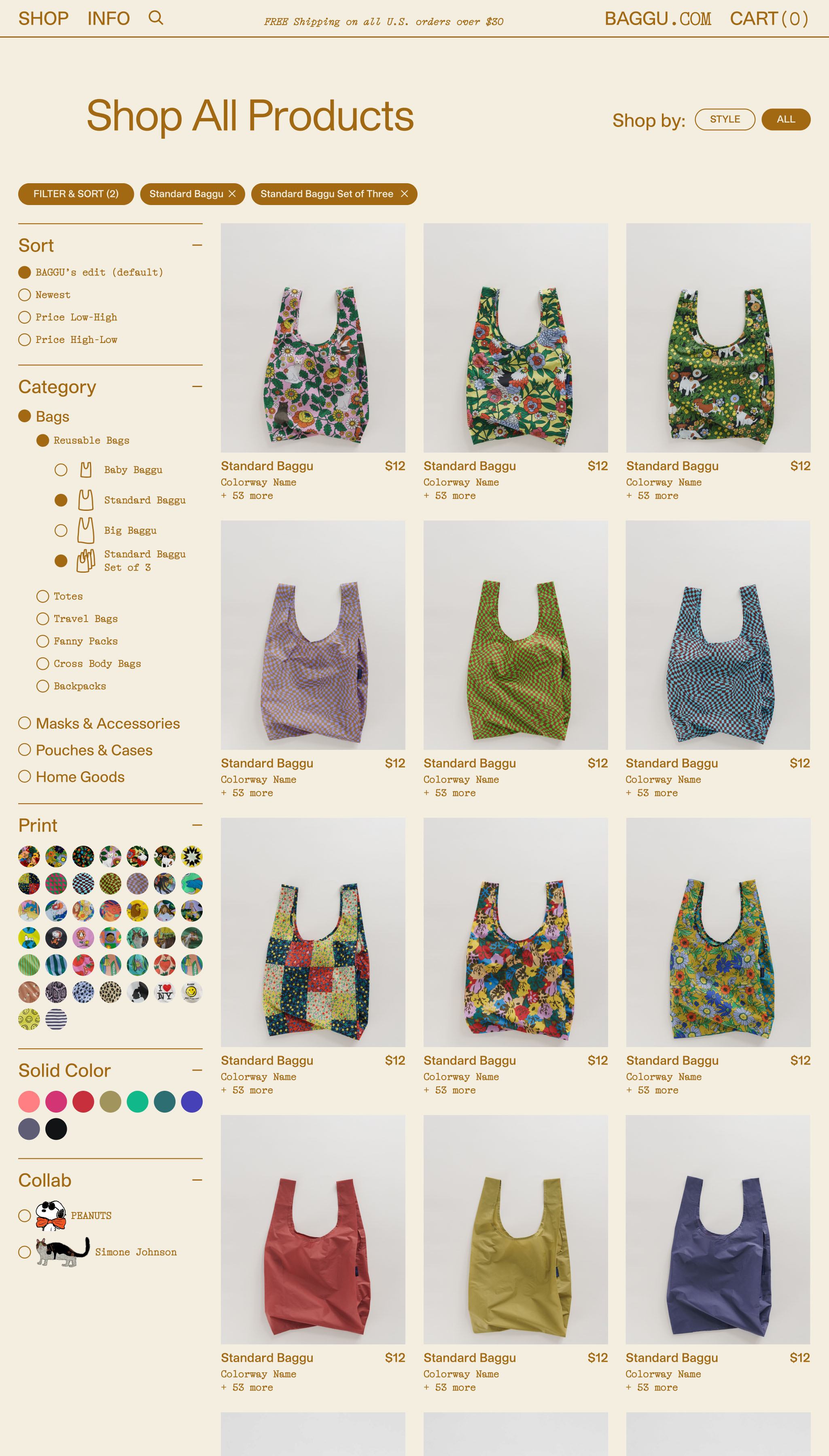
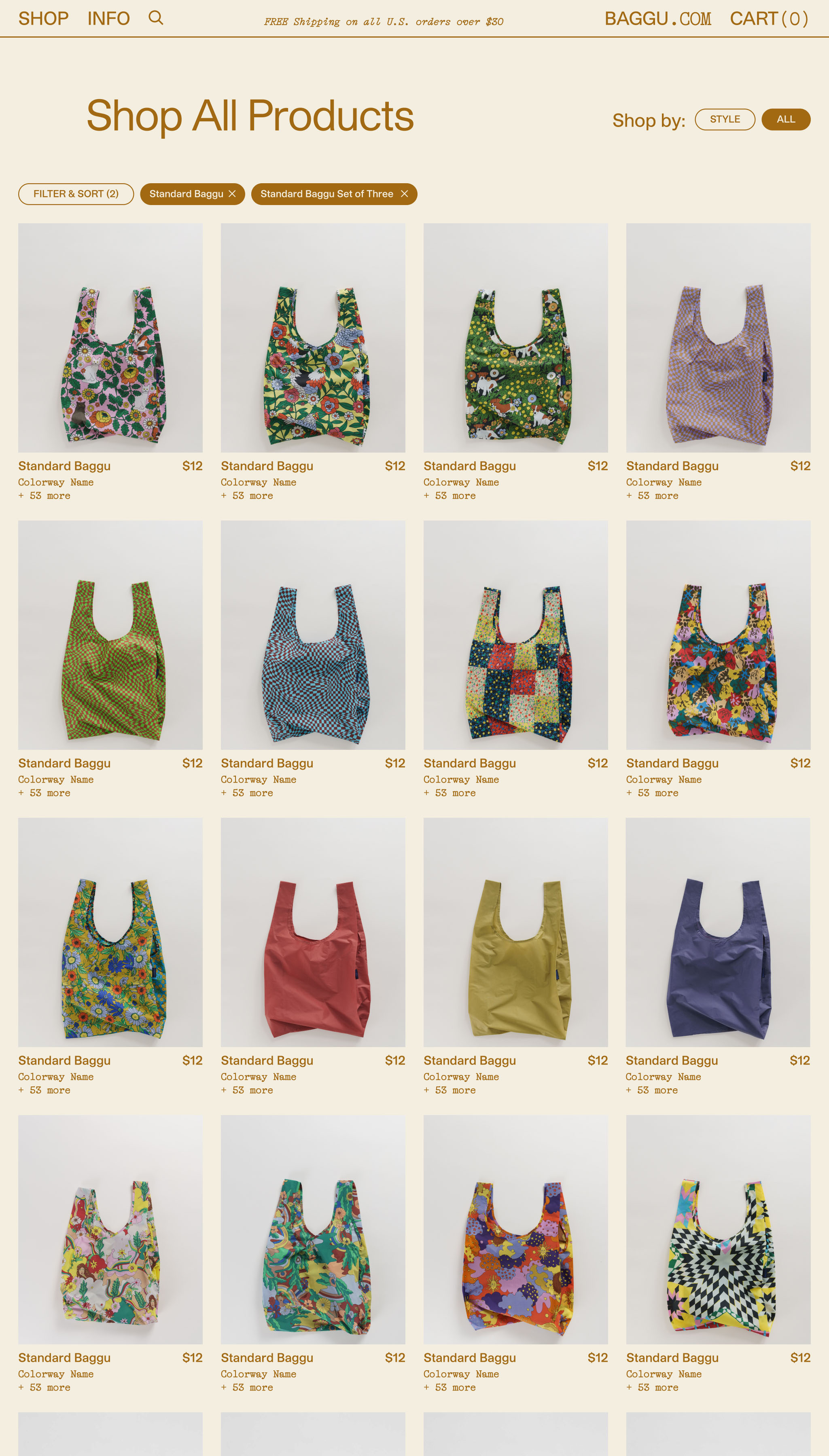
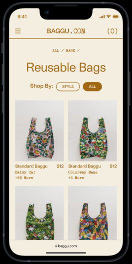
Right: To accommodate this, most collections could be toggled from the “style" view to a straightforward grid, an easier format for browsing prints and colors. A custom filtering system provided additional tools for narrowing down the selection.
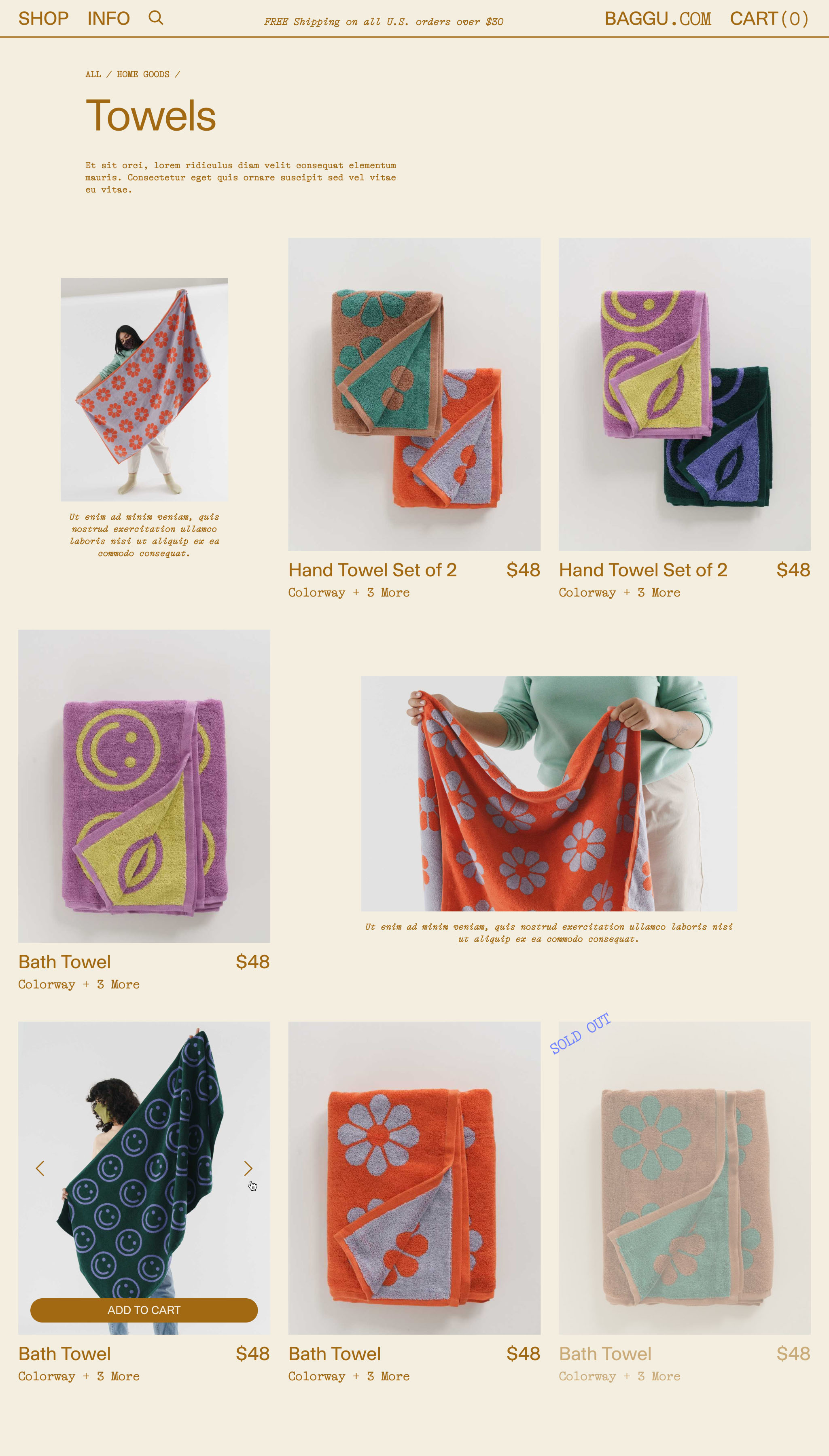
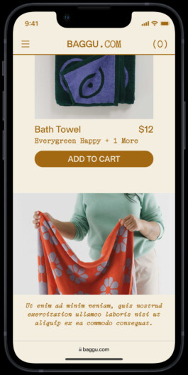
Still, other collections might only include a handful of products — such as special collaborations with partner brands. To help these smaller collections stand out amongst our larger assortment, we designed an “editorial" template that included larger product tiles and modular editorial content.
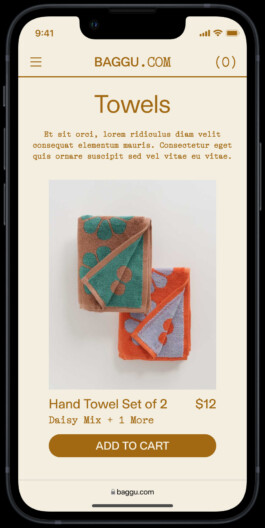
Regardless of which template was used, our ultimate goal was to provide the shortest possible path from landing to checkout. To further that end, all product tiles included on-hover image carousels and “Add to Cart" CTAs.
Product pages built to sell
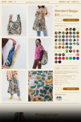
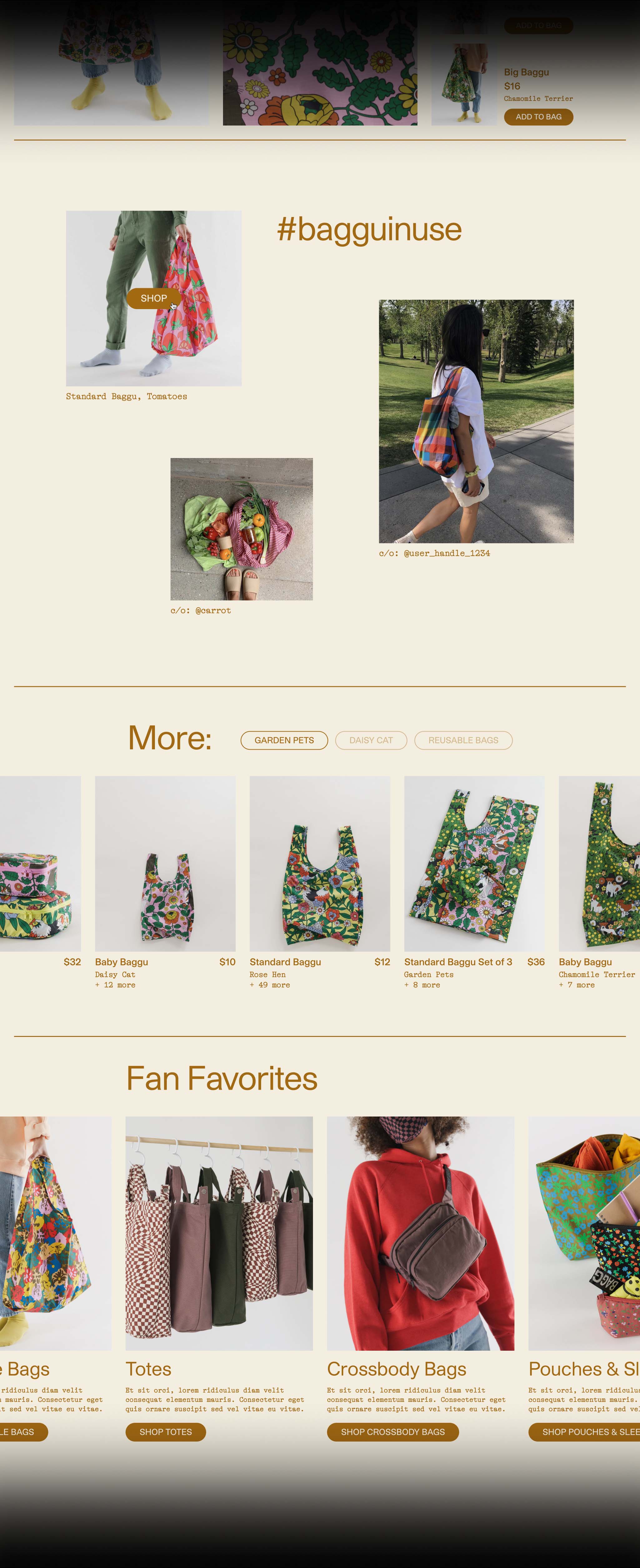
Revised product pages focused on enriched content — large images, video, social content, categorized prints and colorways, consolidated product info — as well as optimized caching for super-fast page repaints when toggling between colorways.
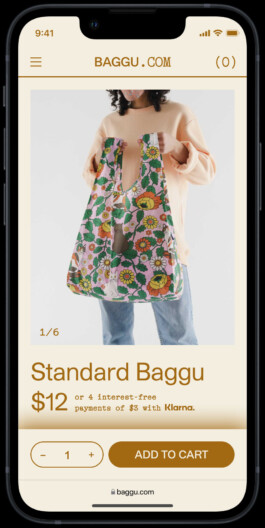
Despite running a headless architecture, we still made the most of our Shopify subscription by syncing images and videos from Sanity back to Shopify and serving them directly from Shopify's CDN. The cost savings were enormous. More on this below.
Modular cross-merchandising
Up to this point, product cross-merchandising had always proved surprisingly difficult. All the off-the-shelf Shopify apps we'd tried proved cumbersome and unreliable for a storefront with hundreds of individual products.
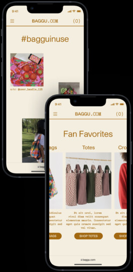
Thankfully, Sanity allowed us to build multiple tools to effectively cross-merchandise — from social content linked directly to the products it featured, to product recommendations based on print families, to featured collections reiterated across the site.
Custom collabs, custom content
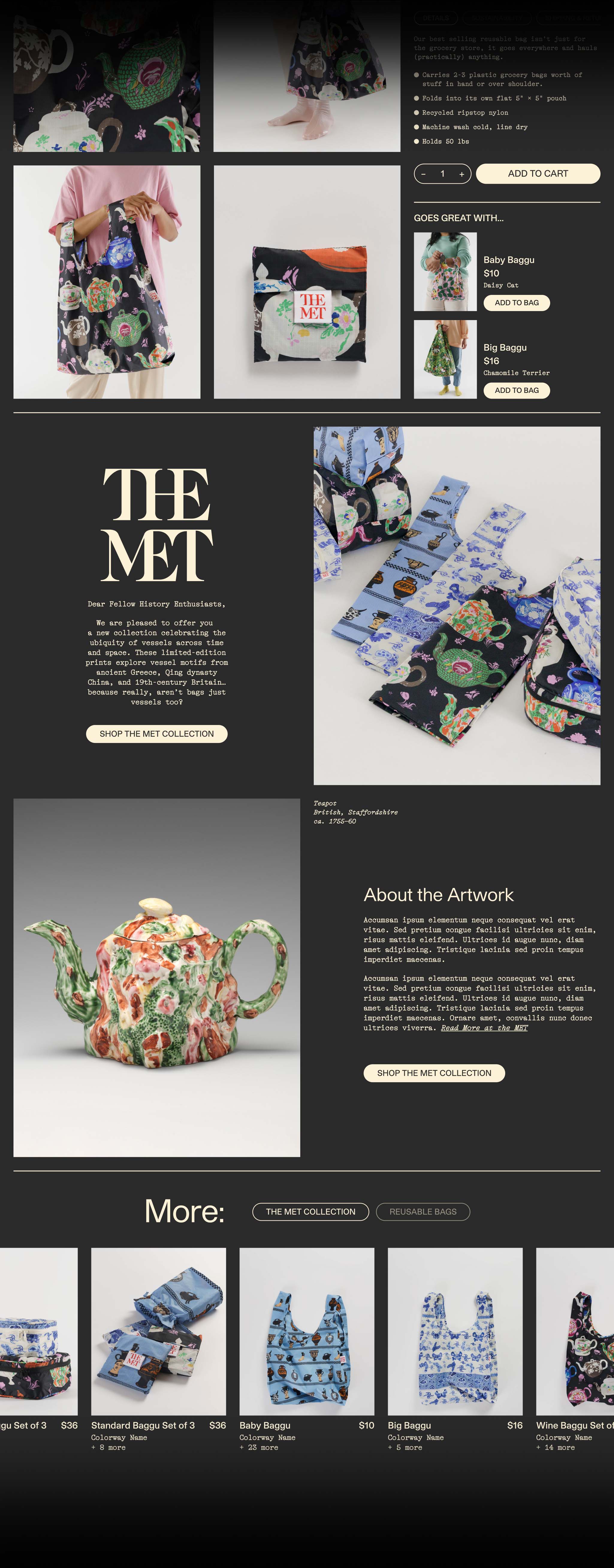
With BAGGU releasing upwards of four collaborations or special collections a year, we wanted a way to highlight collaboration-specific products and differentiate them from the rest of the line.
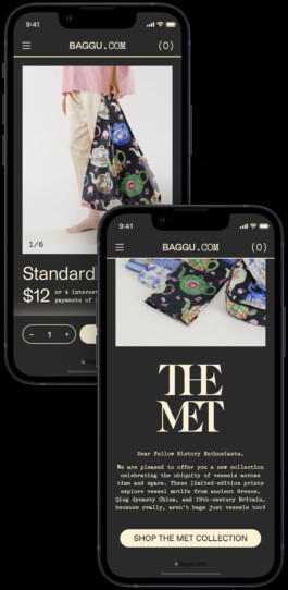
At the product level, we added an optional module for collab-specific content, providing additional context and further highlighting the collection. We also added the ability to apply a custom color scheme to the site when viewing collab-specific collections or products.
Streamlining setup and management for an ever-scaling product line
Prior to the rebuild, ERP constraints required us to maintain individual Shopify products and SKU codes for each of our sales channels (retail, wholesale, stores, Amazon and custom). This meant that for a “single” colorway of a product (eg. “Standard Baggu” in the color “Lavender”), we could have as many as five individual Shopify products 😳.
At the very least, this meant doing the same product setup work twice: once for our retail storefront, and again for our wholesale storefront. And if a product sold out via one channel, we’d often reallocate stock from another channel or even storefront to satisfy demand — meaning we’d need to set up the “same” product once again 🤦♂️
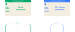
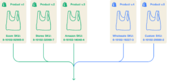
To streamline this process, we used Sanity to replicate a parent/variant product architecture, then mapped multiple Shopify products/SKUs onto single variants within Sanity Studio. We’d set up the parent product first, (eg. “Standard Baggu”), then bulk upload information to populate the various colorway variants (eg. “Lavender”, etc).
From there, we’d import the associated SKUs from our Shopify storefronts and assign them to our retail and wholesale channels. By assigning multiple SKUs to a given channel, we’d provide an automatic inventory fallback if the initial SKU sold out.
Making the most of Shopify’s CDN
Of course, going headless presented other challenges. One of the largest was that we now had to pay for additional hosting beyond Shopify Plus — and that cost was only going to grow with our site traffic.
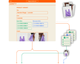
To minimize this, we used Shopify’s CDN to serve as much content as possible — particularly image assets and video. Images and videos uploaded in Sanity were synced over to our Shopify storefronts, and the associated asset URLs were then synced back into Sanity and used to serve the images in the frontend build.

Tying it all back together with Shopify checkout
Once a customer started adding items to their cart, we used Shopify checkout to track their unique cart session and process their order once they hit “Checkout". For all the custom development we did, we figured there wasn't any sense messing with the internet's most familiar e-com checkout!

Built for iteration
Despite the redesign, the new CMS, the new processes… the site was never intended to be a finished product. On the contrary, it was intended as a fresh starting point for BAGGU's e-commerce efforts going forward, and our explicit goal was that the site would continue change and evolve as we grew our digital product team.
The site in its current iteration has already evolved from where it started. New features have been built, others reworked, but the overall form of the site remains.
BAGGU: E-com Rebuild
E-com, UI, UX
I wore a lot of hats at BAGGU — in addition to being our Creative Director for brand, I was also our digital product design lead. My tenure coincided with period of massive growth for BAGGU's e-commerce channels, and over the course of five years I worked on numerous improvements to our e-com sites, all aimed at furthering that growth.
The largest of these was a complete headless rebuild of our two primary e-com channels — baggu.com and wholesale.baggu.com.
The recommendation to go headless came from our product manager, Kara O'Connor, who saw opportunities to minimize load times, improve site performance, streamline operations, and augment our analytics. She also sourced an amazing development team — Kevin Green of ctrl alt delete, along with the folks at Baggy.
I was the sole designer for most of the project, delivering design from wireframes and mockups, to prototypes used for testing, to production specs and QA. Freed from the usual limitations of Shopify's architecture, the rebuild was a perfect opportunity to redesign the whole site from the ground up, resolving a host of known pain points and actualizing a long wishlist of custom features.
The project was a huge lift run on a skeleton crew, but we nevertheless managed to relaunch on time and on budget. Many thanks to all involved ✨🙏✨
Project Team
Development: Kevin Green
Additional development: Baggy
Design, prototyping, QA: myself
Design assistance: Julie Kim
Product & project management: Kara O'Connor
Content population & e-com operations: Farrah Wong, Todd Nguyen
Tech stack: Next, React, Shopify, Sanity, Algolia

Twice the channels, half the management
Prior to the rebuild, one of our biggest operational challenges was running two separate Shopify storefronts — one for retail (baggu.com), one for wholesale (wholesale.baggu.com). With every new season launch, we needed do essentially the same product and collection setup work twice, and every season was getting bigger and more complicated than the last.
The new headless CMS — built on Sanity — vastly streamlined our setup process. Products and collections could be populated once and then pushed to both retail and wholesale, with any necessary data automatically syncing back to the individual Shopify storefronts.

Flexible collection landings, designed for product assortments at every scale
Merchandising was another perpetual challenge. How do you present an assortment that includes hundreds of bags, dozens of pouches and cases, and then a scattered handful of other things like hats, towels, and accessories? Our solution was to develop a suite of templates suited to different collection scales, as well as different users' browsing preferences.

The first of these templates was a “style" based collection, specifically aimed at newer customers. BAGGU produces a lot of very similar products in varying sizes and shapes — eg. Baby Baggu, Standard Baggu, Big Baggu, etc. — and so we needed a way to make similar product styles quickly comparable for someone unfamiliar with the line.

We also had to manage the reality that our best selling product category — reusable bags — often included dozens of individual products featuring bold, colorful prints. Seasoned fans knew the line well, and would return to shop new prints and colors specifically.
Below: To accommodate this, most collections could be toggled from the “style" view to a straightforward grid, an easier format for browsing prints and colors. A custom filtering system provided additional tools for narrowing down the selection.


Below: Still, other collections might only include a handful of products — such as special collaborations with partner brands. To help these smaller collections stand out amongst our larger assortment, we designed an “editorial" template that included larger product tiles and modular editorial content.


Regardless of which template was used, our ultimate goal was to provide the shortest possible path from landing to checkout. To further that end, all product tiles included on-hover image carousels and “Add to Cart" CTAs.

Product pages built to sell
Revised product pages focused on enriched content — large images, video, social content, categorized prints and colorways, consolidated product info — as well as optimized caching for super-fast page repaints when toggling between colorways.

Despite running a headless architecture, we still made the most of our Shopify subscription by syncing images and videos from Sanity back to Shopify and serving them directly from Shopify's CDN. The cost savings were enormous. More on this below.
Modular cross-merchandising
Up to this point, product cross-merchandising had always proved surprisingly difficult. All the off-the-shelf Shopify apps we'd tried proved cumbersome and unreliable for a storefront with hundreds of individual products.
Thankfully, Sanity allowed us to build multiple tools to effectively cross-merchandise — from social content linked directly to the products it featured, to product recommendations based on print families, to featured collections reiterated across the site.


Custom collabs, custom content
With BAGGU releasing upwards of four collaborations or special collections a year, we wanted a way to highlight collaboration-specific products and differentiate them from the rest of the line.
At the product level, we added an optional module for collab-specific content, providing additional context and further highlighting the collection. We also added the ability to apply a custom color scheme to the site when viewing collab-specific collections or products.


Streamlining setup and management for an ever-scaling product line
Prior to the rebuild, ERP constraints required us to maintain individual Shopify products and SKU codes for each of our sales channels (retail, wholesale, stores, Amazon and custom). This meant that for a “single” colorway of a product (eg. “Standard Baggu” in the color “Lavender”), we could have as many as five individual Shopify products 😳.
At the very least, this meant doing the same product setup work twice: once for our retail storefront, and again for our wholesale storefront. And if a product sold out via one channel, we’d often reallocate stock from another channel or even storefront to satisfy demand — meaning we’d need to set up the “same” product once again 🤦♂️


To streamline this process, we used Sanity to replicate a parent/variant product architecture, then mapped multiple Shopify products/SKUs onto single variants within Sanity Studio. We’d set up the parent product first, (eg. “Standard Baggu”), then bulk upload information to populate the various colorway variants (eg. “Lavender”, etc).
From there, we’d import the associated SKUs from our Shopify storefronts and assign them to our retail and wholesale channels. By assigning multiple SKUs to a given channel, we’d provide an automatic inventory fallback if the initial SKU sold out.
Making the most of Shopify’s CDN
Of course, going headless presented other challenges. One of the largest was that we now had to pay for additional hosting beyond Shopify Plus — and that cost was only going to grow with our site traffic.
To minimize this, we used Shopify’s CDN to serve as much content as possible — particularly image assets and video. Images and videos uploaded in Sanity were synced over to our Shopify storefronts, and the associated asset URLs were then synced back into Sanity and used to serve the images in the frontend build.
Tying it all back together with Shopify checkout
Once a customer started adding items to their cart, we used Shopify checkout to track their unique cart session and process their order once they hit “Checkout". For all the custom development we did, we figured there wasn't any sense messing with the internet's most familiar e-com checkout!
Built for iteration
Despite the redesign, the new CMS, the new processes… the site was never intended to be a finished product. On the contrary, it was intended as a fresh starting point for BAGGU's e-commerce efforts going forward, and our explicit goal was that the site would continue change and evolve as we grew our digital product team.
The site in its current iteration has already evolved from where it started. New features have been built, others reworked, but the overall form of the site remains.