I was in the thick of six or seven other projects at Rapt Studio when this landed on my desk.
Our client, Stripe, was quickly outgrowing their current office space, and Rapt was helping them set up temporary offices throughout San Francisco. Naturally, Stripe wanted these spaces to feel somehow connected to their brand.
This was early days for Stripe, and while they had plenty of name recognition, they had no brand assets or guidelines to speak of.
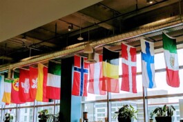
Basically, I had two things to work with — their logo, and the fact that they’d hung a bunch of national flags in their office in a nod to their global aspirations (right).
National flags made sense for a company eyeing global expansion, but in my mind they felt too staid for a business built around realtime financial transactions, uninhibited by terrestrial constraints.
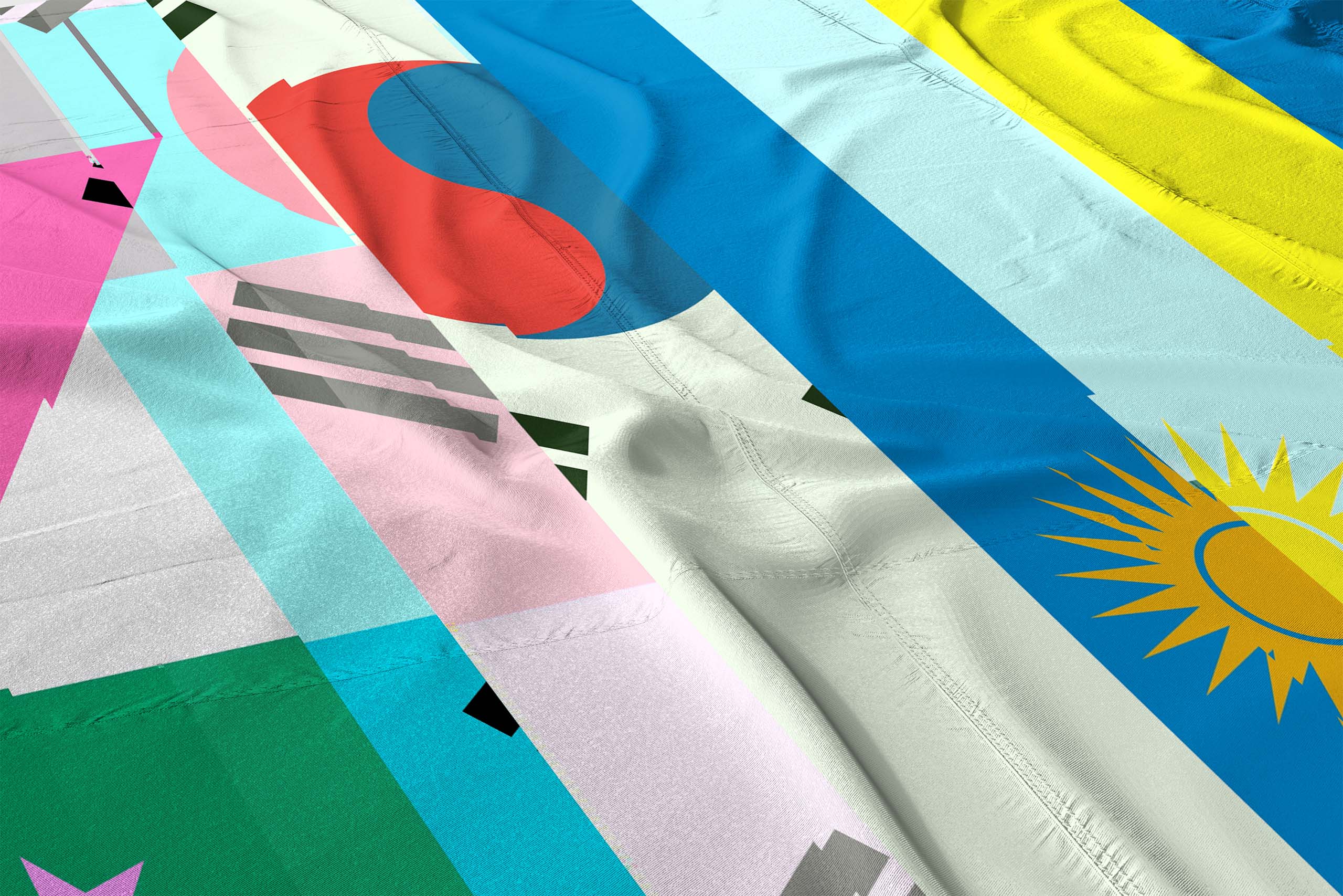
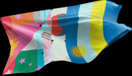
As such, I proposed a new set of flags: ones generated by compressing and corrupting multiple flag images into one another.
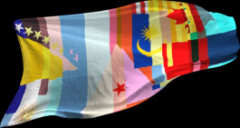
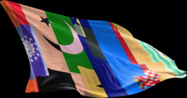
The result was a vexillological abstraction of digital commerce — a space where national boundaries dissolved into one another, compressed through the speed of electronic transmission.
The finished flags could be digitally printed, inexpensively produced and easily moved from one temporary office to another.
Of course, Stripe wanted to see their logo in these temporary spaces as well.
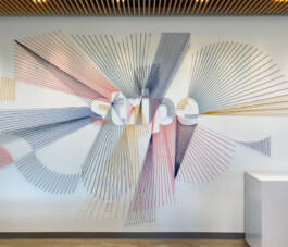
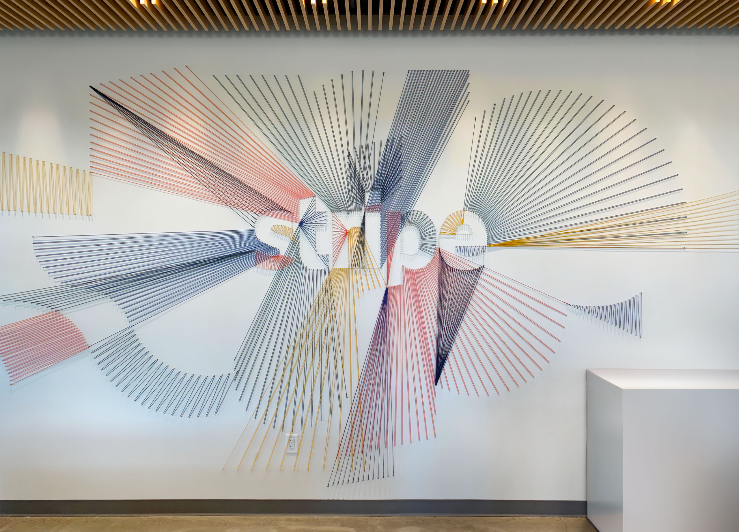
Sticking with the ideas of disruption and interconnection, I proposed exploding the logo into a network of rays, expanding its contours into the surrounding space and drawing connections between the various edges.
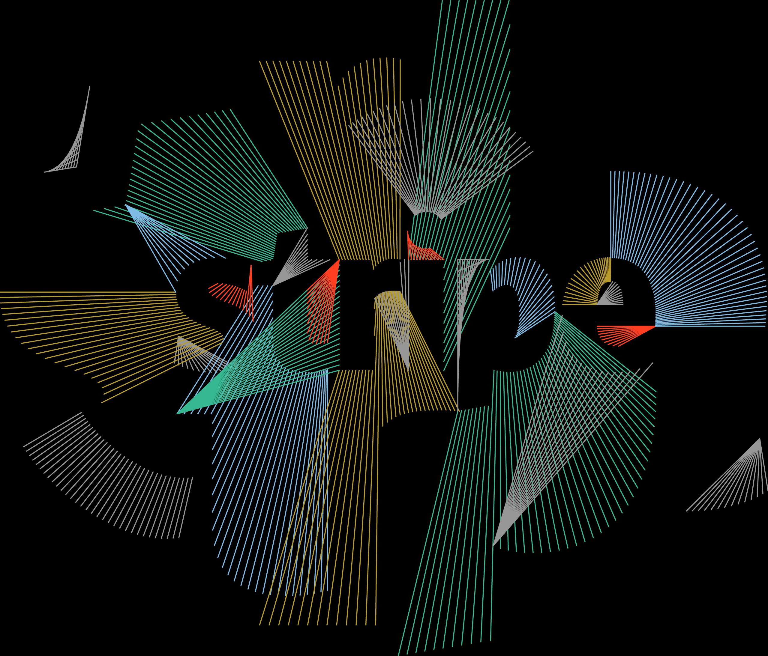
Below: The finished result was delivered as a wall-sized supergraphic rendered in colored string — a reference to midcentury decor, since Stripe’s furniture palette was largely midcentury modern.
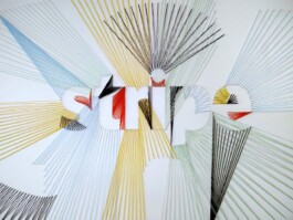
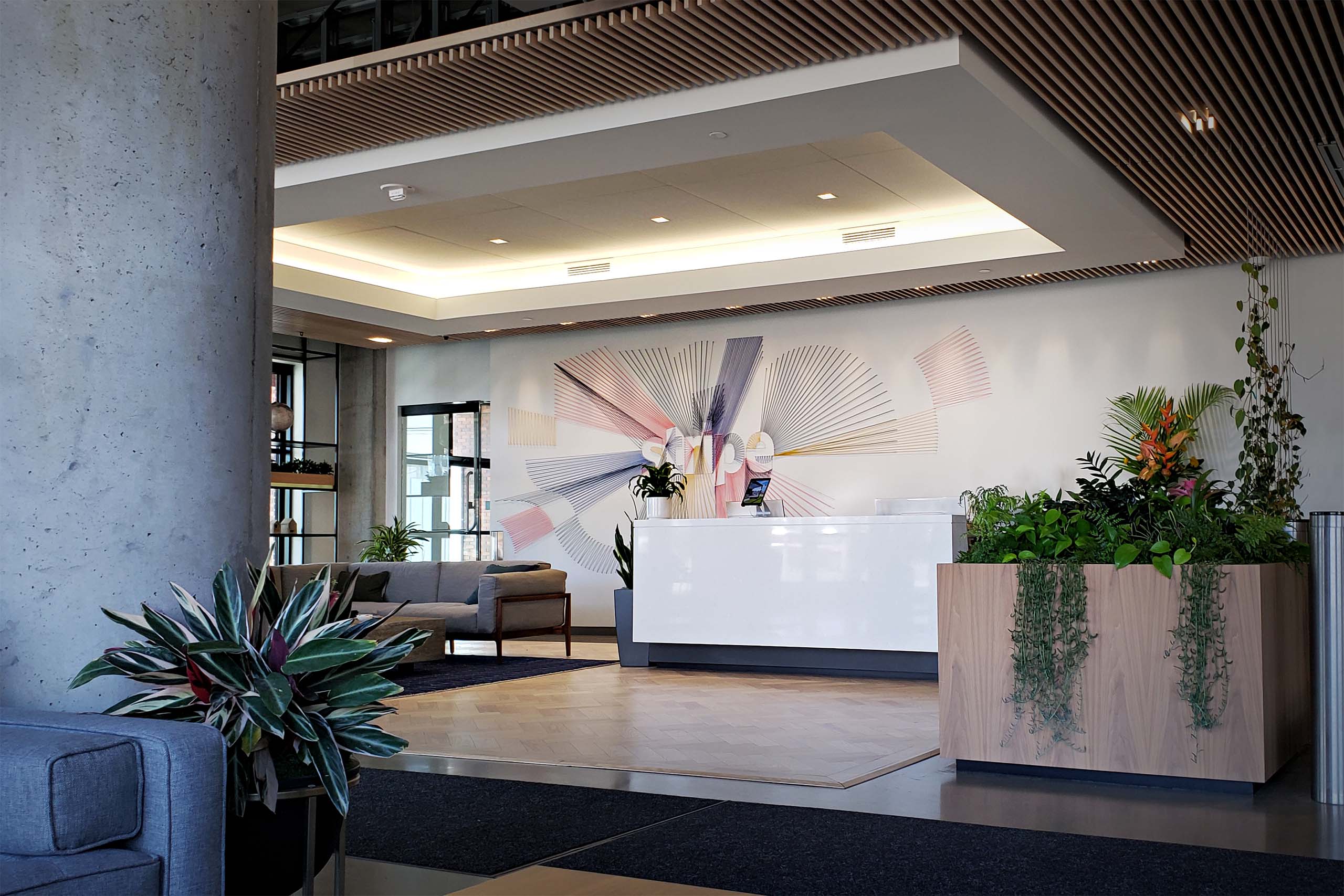
Several years later I visited a friend at Stripe’s then-new headquarters in San Francisco, and discovered that they had reconstructed my logo treatment right there in their main lobby.
They’d made some adjustments — scaled the proportions to fit the wall, updated geometry to match their revised logo, tweaked the color palette — but overall the effect was very much the same. It was nice to see the work recycled in such a prominent place.
Stripe
Corporate Artwork, Environmental Graphics
I was in the thick of six or seven other projects at Rapt Studio when this landed on my desk.
Our client, Stripe, was quickly outgrowing their current office space, and Rapt was helping them set up temporary offices throughout San Francisco. Naturally, Stripe wanted these spaces to feel somehow connected to their brand.
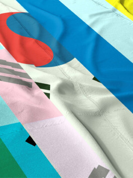
This was early days for Stripe, and while they had plenty of name recognition, they had no brand assets or guidelines to speak of. Basically, I had two things to work with — their logo, and the fact that they’d hung a bunch of national flags in their office in a nod to their global aspirations (below).

National flags made sense for a company eyeing global expansion, but in my mind they felt too staid for a business built around realtime financial transactions, uninhibited by terrestrial constraints.

As such, I proposed a new set of flags: ones generated by compressing and corrupting multiple flag images into one another.

The result was a vexillological abstraction of digital commerce — a space where national boundaries dissolved into one another, compressed through the speed of electronic transmission.

The finished flags could be digitally printed, inexpensively produced and easily moved from one temporary office to another.

Of course, Stripe wanted to see their logo in these temporary spaces as well.
Sticking with the ideas of disruption and interconnection, I proposed exploding the logo into a network of rays, expanding its contours into the surrounding space and drawing connections between the various edges.

Above: The finished result was delivered as a wall-sized supergraphic rendered in colored string — a reference to midcentury decor, since Stripe’s furniture palette was largely midcentury modern.

Several years later I visited a friend at Stripe’s then-new headquarters in San Francisco, and discovered that they had reconstructed my logo treatment right there in their main lobby. They’d made some adjustments, but overall the effect was very much the same.
It was nice to see the work recycled in such a prominent place.
