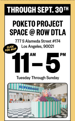
Direction and design for SUPERBAGGU — a concept corner grocery store, conceived to promote BAGGU’S namesake line of reusable shopping bags.
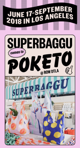
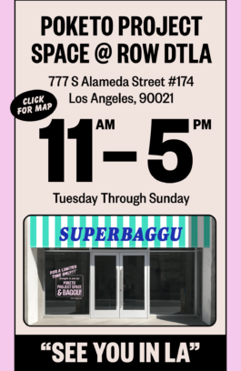
Originally executed as a pop-up activation at West Coast Craft in San Francisco, SUPERBAGGU later took up residence at POKETO’S DTLA project space for several months, selling seasonal collections of BAGGU products.
The project was a playful, elaborate branding exercise meant to underscore a simple association — that grocery shopping and reusable bags should go hand-in-hand.
My role was end-to-end, including concepting, creative direction, and design for everything from the brand identity to the retail fixtures. Additional design assistance by Jessy Agle.
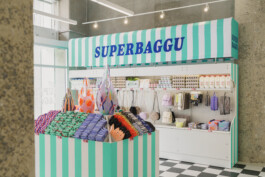
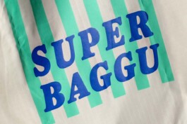
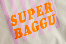
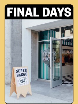
The SUPERBAGGU wordmark incorporated striping as a simple but powerful graphic device — something that could be repeated across any number of brand touchpoints (including the retail displays themselves) and which referenced the striped awnings once commonly found in front of small corner grocery stores.
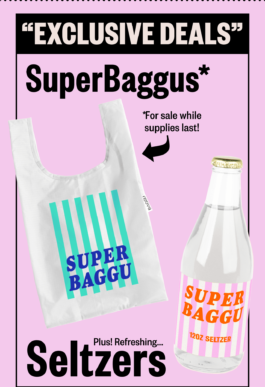
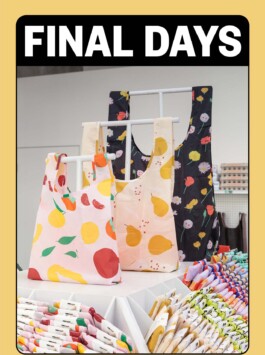
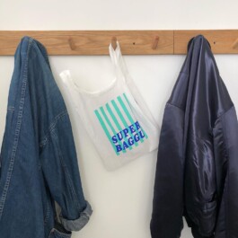
Naturally, we produced limited edition SUPERBAGGU-branded reusable bags, available only at the popup’s various iterations.
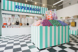
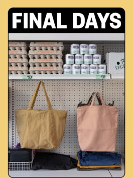
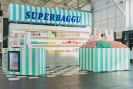
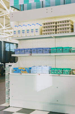
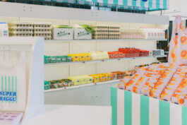
The display fixtures were meant to mimic the fixtures of an actual grocery store — cooler displays, produce stands, etc. — and utilized generic shelving racks and pegboard backing to further the effect.
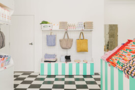
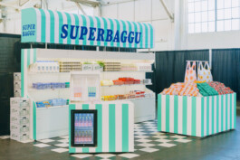
SUPERBAGGU’s initial installation at West Coast Craft, complete with backstock stored in off-the-shelf produce boxes, and a “checkout counter” display for the custom reusable bags.
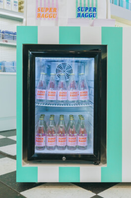
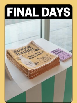
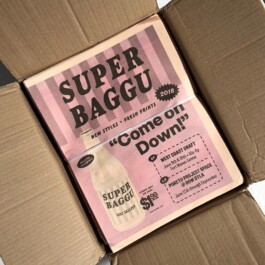
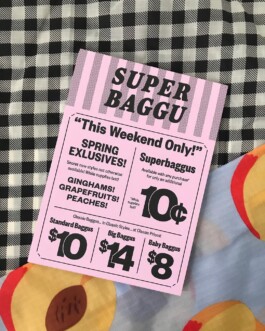
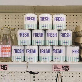
In addition to custom bags, we produced a whole variety of SUPERBAGGU-branded consumables and merchandising props — seltzer waters, promotional postcards, newsprint catalogs styled after coupon circulars, as well as fake milk and egg cartons.
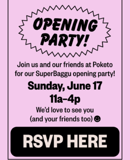
Working the brand language into digital assets for email and social was particularly fun.



SUPERBAGGU
Branding, Design Systems, Events, Marketing, Physical Retail
Direction and design for SUPERBAGGU — a concept corner grocery store, conceived to promote BAGGU’S namesake line of reusable shopping bags.
Originally executed as a pop-up activation at West Coast Craft in San Francisco, SUPERBAGGU later took up residence at POKETO’S DTLA project space for several months, selling seasonal collections of BAGGU products.

The project was a playful, elaborate branding exercise meant to underscore a simple association — that grocery shopping and reusable bags should go hand-in-hand.

My role was end-to-end, including concepting, creative direction, and design for everything from the brand identity to the retail fixtures. Additional design assistance by Jessy Agle.


The SUPERBAGGU wordmark incorporated striping as a simple but powerful graphic device — something that could be repeated across any number of brand touchpoints (including the retail displays themselves) and which referenced the striped awnings once commonly found in front of small corner grocery stores.

Naturally, we produced limited edition SUPERBAGGU-branded reusable bags, available only at the popup’s various iterations.

The display fixtures were meant to mimic the fixtures of an actual grocery store — cooler displays, produce stands, etc. — and utilized generic shelving racks and pegboard backing to further the effect.

SUPERBAGGU’s initial installation at West Coast Craft, complete with backstock stored in off-the-shelf produce boxes, and a “checkout counter” display for the custom reusable bags.


In addition to custom bags, we produced a whole variety of SUPERBAGGU-branded consumables and merchandising props — seltzer waters, promotional postcards, newsprint catalogs styled after coupon circulars, as well as fake milk and egg cartons.


Working the brand language into digital assets for email and social was particularly fun.
